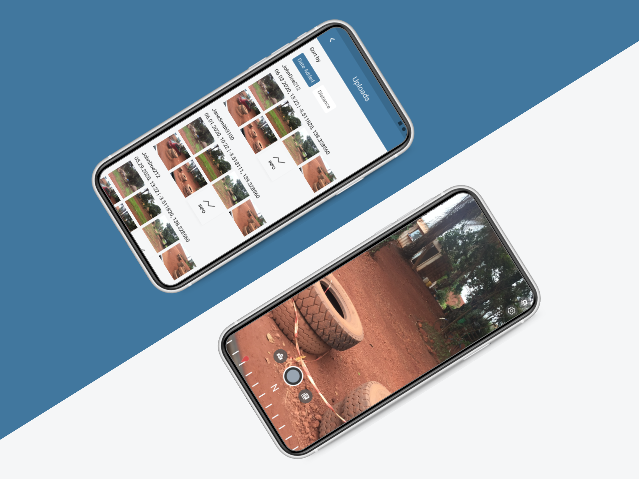
What is Mobile Justice?
Mobile Justice is a mobile bystander documentation app. It records high quality video that is sent to server monitored by the ACLU. The ACLU team can then catalogue the videos and flag any malicious activity. The technology behind this product was initially developed during the Bloomberg "Stop and Frisk" era in NYC.
Technology timeline
The opportunity
Redesign the Mobile Justice App and Portal for the ACLU in order to create a user friendly system for multiple ACLU affiliates to receive and report police misconduct. For this project I went through 2 phases of redesigns, conducted interviews and user/beta testing over the course of 1 year.
Reskin Mobile
With new management I was able to interact directly with the point of contact from the ACLU. He was dissatisfied with the current theme of the app and wanted it to reflect the ACLU’s new branding. I focused on making the app accessible moving away from the harsh colors and using creams and blues.
Left: previous designs, Right: My initial redesigns
Additional discovery
During this time in the project I took it upon myself to define the key user groups and their current user flows.
Part 2. Video management portal
This web app is used to review videos that are recorded by mobile app users. The designs in place led to many complications for the developers, no pagination led to long load times and broken videos. In addition, a secondary screen where advanced actions were located forced the user to go back and forth between pages to do most of their tasks. This also created additional frustration because filters did not persist.
Video feed
Video detail
What did you do?
First I did my research, I checked out different bootstrap portal templates, reviewed CMS platforms and began to develop my solution. I devised that a table view with a side panel to do additional actions would be easy to manage and would solve the major pain points of our portal users.
Research & wireframes
The result
Simplified user flow & improved features
Eliminating the secondary screen lets our portal users complete their tasks all from one place. In addition to improving the key user flow I also made updates to the Know Your Rights CMS where affiliates can add their own articles in multiple languages and to the Notification Builder, now with a notification preview that shows a simulation of what the notification will look like on different device platforms.
Initial flow
Improved flow
Know Your Rights CMS
Notification builder
Part 3. Best Practices
In Spring 2021 our engineering team made the transition to NS8 and Xplat. This migration gave me one more opportunity to examine my designs and make some minor adjustments to navigation, layouts and user flows using all the best practices I learned over the past year as a product designer.
Notifications view
Eliminating the card component lets the content breath and take up
more of the canvas
Simplified Trusted Contacts flow
Less, but better
Affiliate selection, adding guard rails
The original design the list item was selectable which made scrolling and selecting too similar of an action. In my updated design I used my normalized navigation and a select state to safeguard against this all-to-common user mistake.
My Videos
iOS 14 restricted certain behind the scenes actions the app had in place. One that had major impact was that video syncing could no longer be automated, but instead had to be done manually by the user. This led to a completely new user flow where the user uses a menu item to sync their videos to the server.
Recording screen
To better communicate the status of the recorded videos we added a series of toasts that inform the user what is going on with their recording.
Recording screen Visual & bug QA
Being the sole designer at my company I know the designs and user flows better than anyone. This led me to testing builds, reporting my findings and creating Trello tickets for my developers. You can see examples of my documentation and ticket creation below.
Success metrics
