Last summer, chiropractor practice Prestige Health and Wellness reached out to the team at Quadrant 2. Less patients were visiting due to COVID-19, inspiring the practice to examine their patient efficiencies.
The analog whiteboard
(the problem space)
Doctors and practitioners use a black marker to write the name of a patient all the way to the left on the y-axis. There are several treatments which are listed at the top of the x-axis.
For each patient, a doctor draws a circle and the initials of the administrator for each treatment a patient will receive. When the treatment begins, they simply draw a diagonal line and another when completed (making an x).
Doctors will set a timer that is adhered to the whiteboard all the way to the right for timed treatments and add notes about the appointment where there is room.

To get an idea of how heavily this whiteboard is used that grid of black tape you see was once blue.
This is a ux problem space designers dream about. It’s complex, has so much room for experimentation and—if done right—will positively change the way this practice runs. I couldn’t wait to get started.
Discovery
Prestige provides chiropractic, osteopathy, physical therapy and acupuncture therapies across 3 Manhattan locations for the past 20 years.
They have a team of young doctors ranging between 23–50 YO, all of which are relatively tech savvy and believe digitizing this part of their work flow will make busy days less stressful.
I first visited the practice down in Fi-Di in late May. I watched the team work through the lunch rush and when things died down I conducted my interview. From my findings I determined there are 3 main user groups.
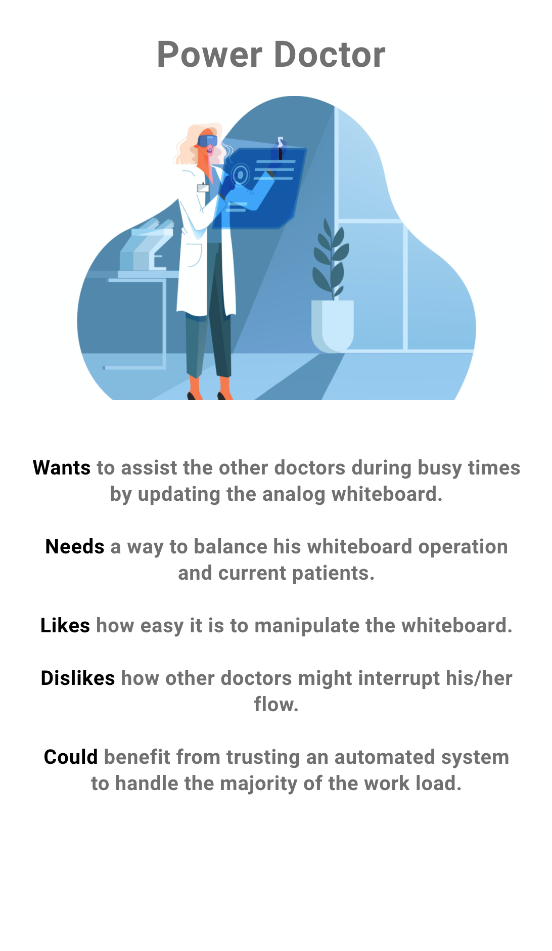
Power Doctor
The power doctor manages the whiteboard during busy parts of the day. Taking on this responsibility allows for the other doctors to treat their patients quickly. The biggest pain point is when the power doctor has to leave the room and someone else takes over the whiteboard, it throws off the power doctors flow and occasionally crucial details get lost.
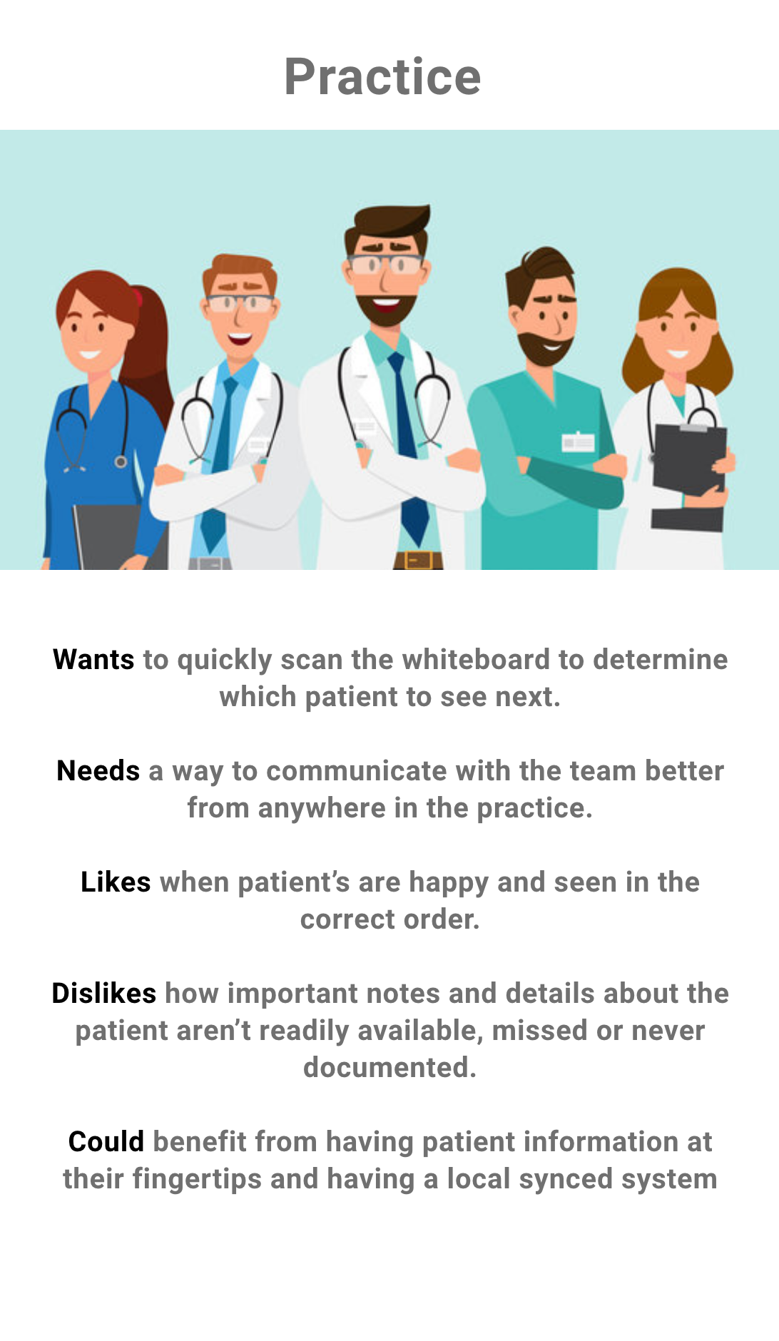
Practice
These are the doctors who are usually taking care of multiple patients at once and informing the power doctor what patients and treatments they are providing. Their main frustrations are when details about a patient aren't made aware to them and being interrupted while administering a treatment.
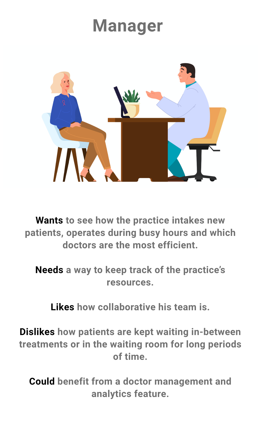
Manager
Managing a practice and a team of doctors takes a lot of energy. Unlike restaurant sales systems that aggregate data there is no system on the market that measures doctor efficiency the same way. Ultimately this leads to a lot of guess work.
Early concepts and analysis

proof of concept
This concept served as a great jumping off point and helped fast track following concepts. However, this first iteration was just a digital version of the current workflow, mimicking the analog whiteboard's x and y axis. It didn't display how appointments would be created on the platform and didn't take full advantage of the digital space. I asked our client for a spreadsheet of all the different treatments, doctors and spaces in the practice. Then explored various management products.
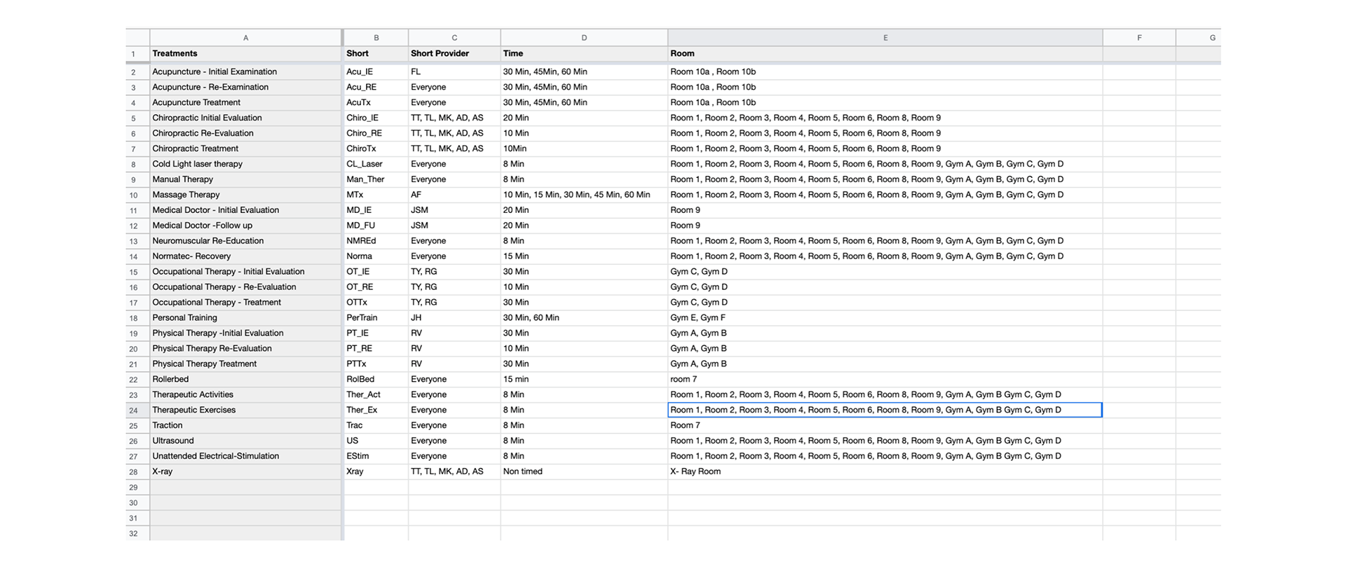
practice spreadsheet
Patient management software is the first area I researched. I couldn't find many tablet experiences and the ones that I found didn't have a real time break down of what was happening in the practice.

patient management software
Project management software was the next rabbit-hole I pursued. Although I found more robust experiences that met some of the needs these products didn't have the real-time interaction I need.

project management software
I called upon my many years of experience in hospitality and familiarized myself with reservation and service management software. These experiences were built for the iPad in mind. If operated correctly they also can give a real time view of what is going on in the restaurant.
restaurant management software
The results
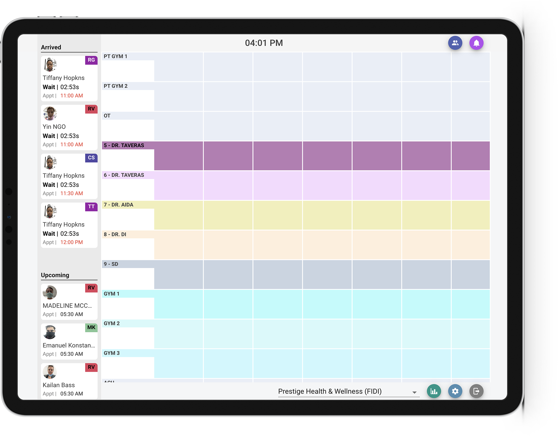
My research into other tools helped me really consider the power of the digital space. This led to a reworking of the x and y axis. The x axis would still represent different rooms while the y axis wouldn't be related to a specific treatment rather the order in which any treatment would be administered.
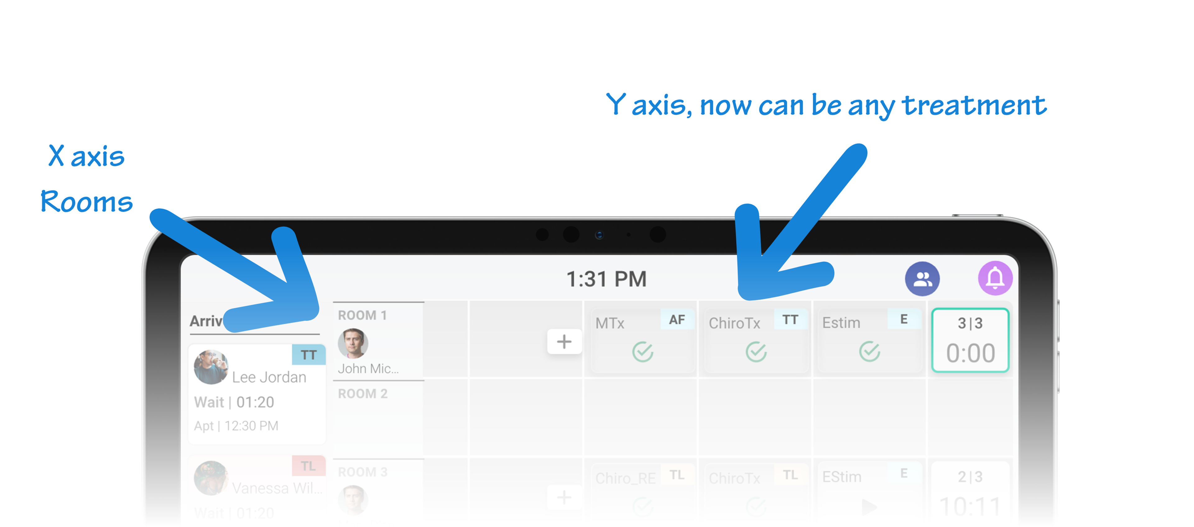
new x and y axis
Thinking in flows, not screens.
(a breakdown of the modals)
As the design process continued I used my discovery findings as my north star. The doctors really liked how malleable and collaborative the analog whiteboard is. I kept those two aspects in the forefront as I worked on the various flows that would set up the practice and appointments.
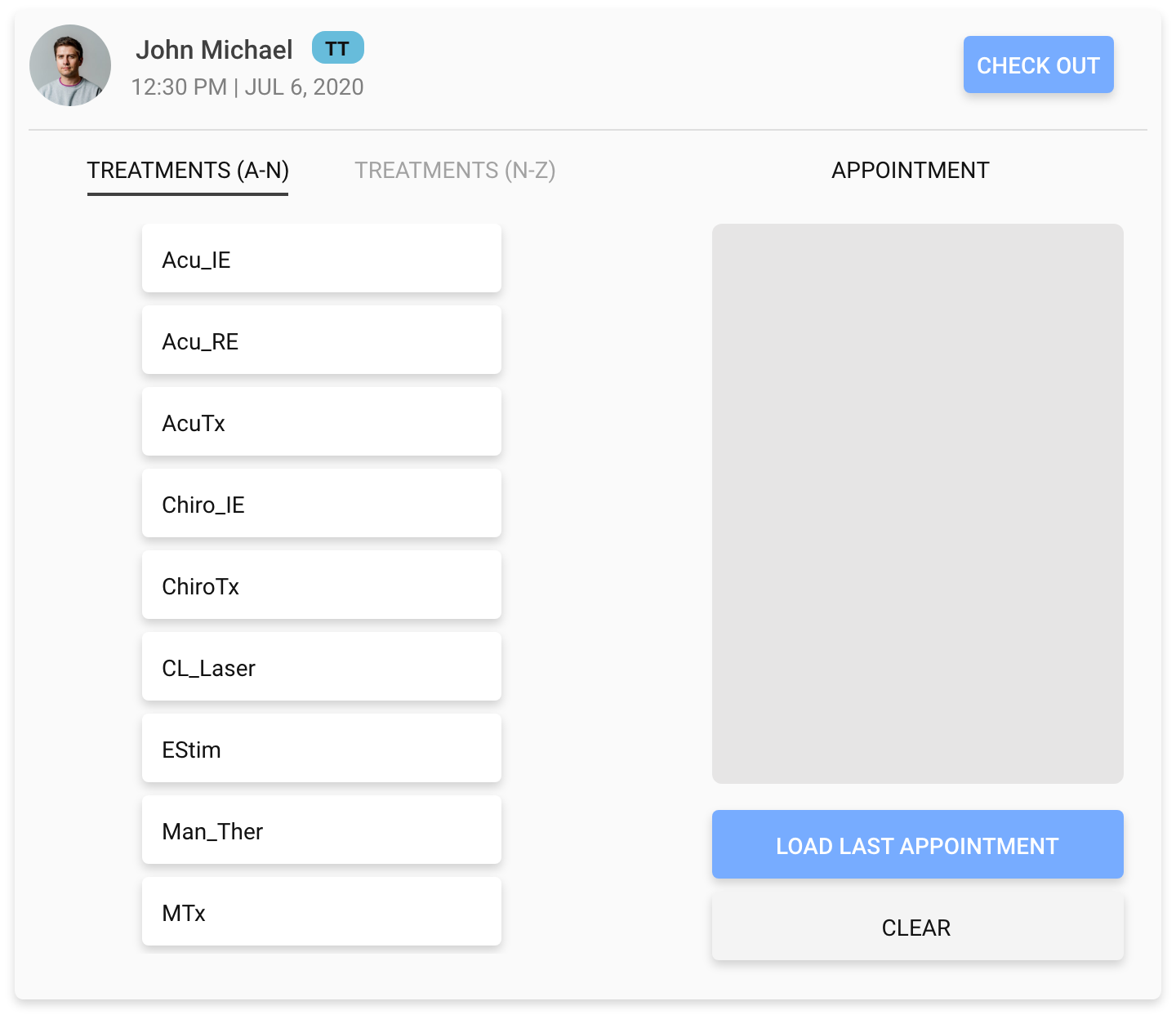
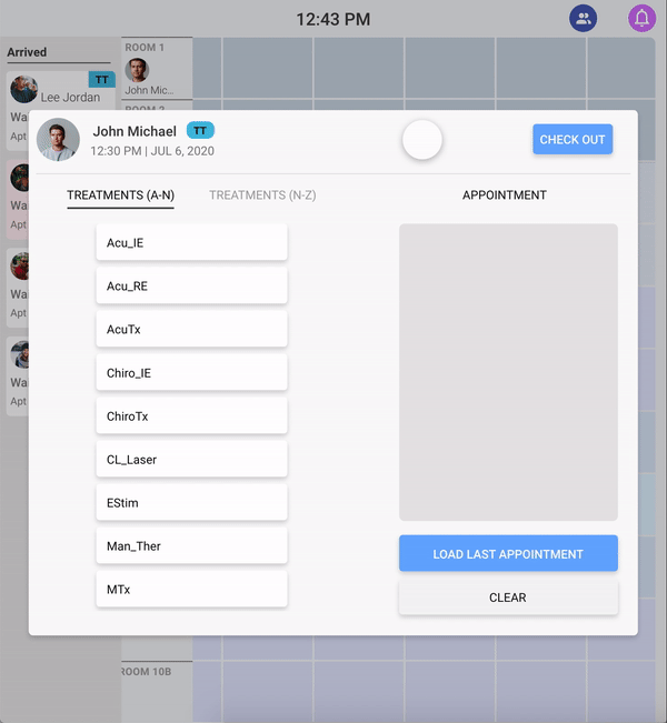
The appointment modal
This first modal allows for members of the practice to add treatments with assigned administrators to a patient's appointment. The added treatments can then be re-ordered and edited as needed.
appointment modal in action
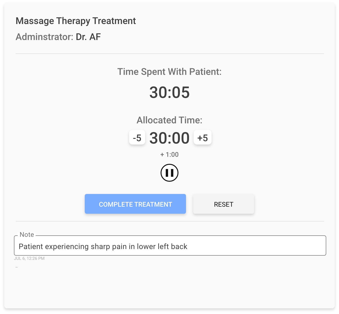
The treatment modal
One of the doctor's biggest pain-points was that there was no way to communicate with other members of the team if a treatment needs more time. This leads to assistants knocking on doors mid-therapy. Accessing the treatment modal practitioners can add and subtract from the allocated time, pause and start a treatment and add a note.
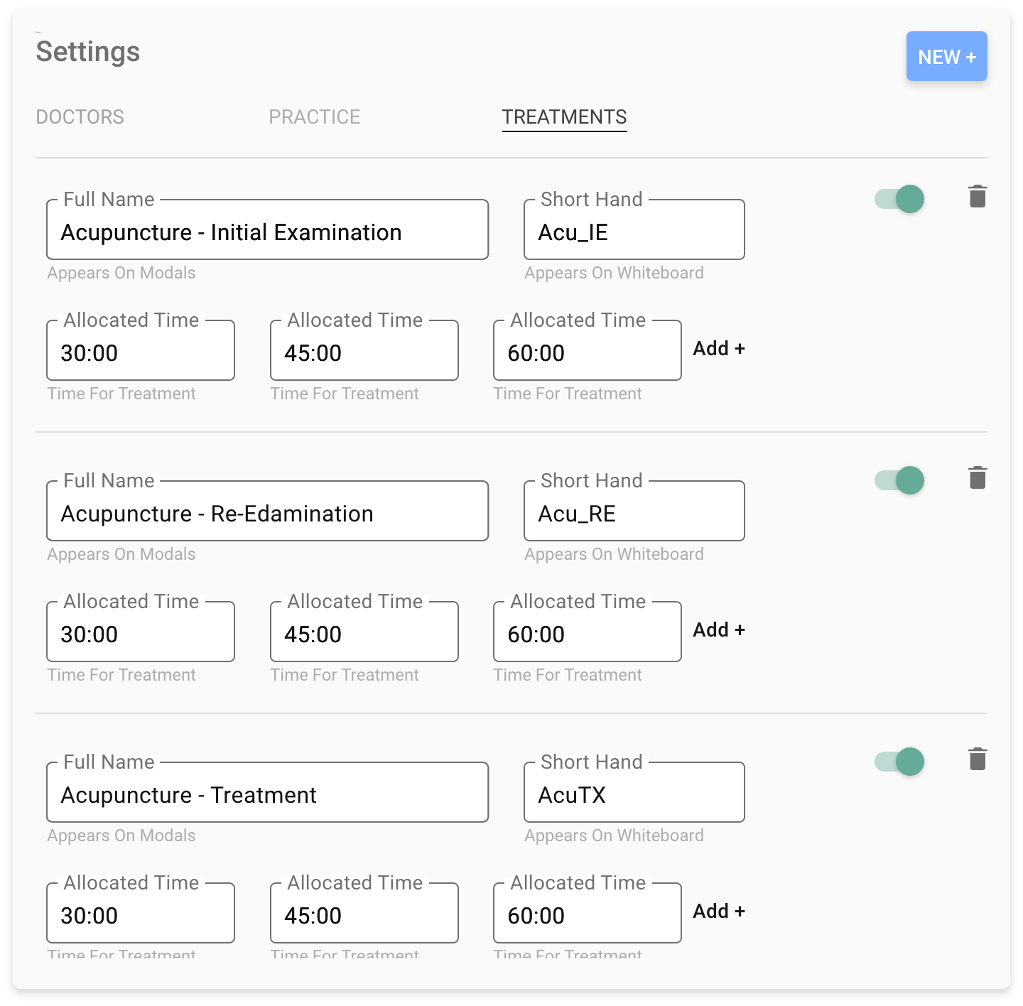
Settings modal
The 3 tab settings modal allows users to set up an entire practice. Each tab informs the others efficiently molding the platform to meet the real world needs of the practice.
Tab 1: Doctors
In this tab you can assign each of your doctors a full name, initials which will appear on the whiteboard, a color and what treatments they can administer. You can also set the doctor as inactive/active or remove them all together.


Tab 2: Practice
Using this tab you can create, title and set which treatments can be administered for every room in your practice. Each room created in this view will be displayed on the whiteboard.
Tab 3: Treatments
The final tab in settings is where you can create treatments for the practice. You give the treatment a full name, shorthand for the whiteboard and at least one allocated time.
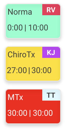
The treatment tiles
(and their many states)
These tiles appear on the digital whiteboard when practitioners finish setting up an appointment. Once on the board users can move them, press them, add notes to them and reorder them.

Default state
When a treatment is added to the board a tile containing the treatment name (top left) and the initials of the practitioner (top right) will appear. This tile will also have a play button that can be pressed when the treatment begins. In addition to a treatment tile there are two companion components that are added automatically. The timer tile (to the right) and the add a treatment node (to the the left)

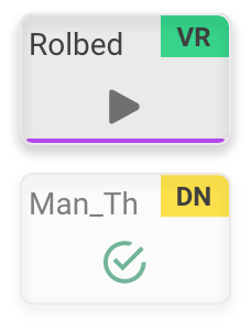
In treatment indications
When a treatment begins it's tile will change from a muted grey to green. The last 3 minutes it becomes yellow and finally becomes red when the treatment is complete. This helps the practitioners keep an eye on the status of each patient. This can be especially important when a patient is in time sensitive therapies.
Note added and complete
Lastly the practitioners want to know what treatments the patient already received until check out and a way to see if notes were ever added to the treatment
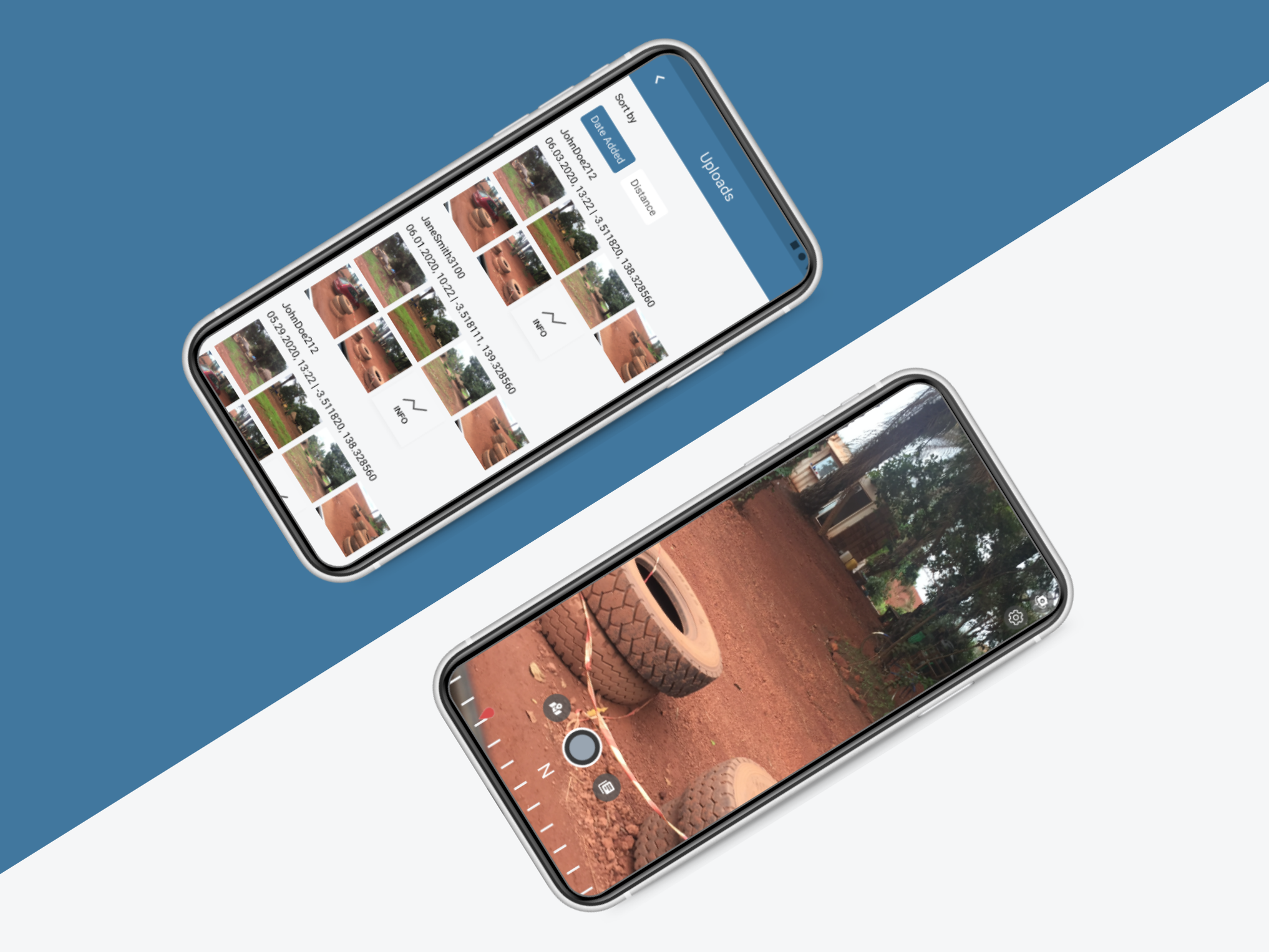
Usability testing and hand off
Using Adobe XD I created a prototype for each of the main work flows and revisited the practice down in FiDi to watch as the doctors practiced using the digital whiteboard. Watch the .gif below or explore the interactive prototype here
User testing script
Annotated component breakdown.
This project has many moving parts and communication with the development team had to be clear. I spent extra time breaking down, annotating and describing the use of each element for the team. (link)
There are 500 API calls per hour for this system to work. It is constantly refreshing and syncing data from the patient database provided by Doctor Chrono then applying treatment, doctor and practice analytics to the front end. The team is in the thick of this process right now.
current state of UI and development
This is the first time I had a chance to work with medical technology, I had a blast diving into the field of chiropractics and wellness and look forward to when this product is live and helping people in the field.